The Deluxe Edition of Civilization VII has been out for just a day, and the online discourse is already dominated by criticism of its user interface and other shortcomings. But is it truly that poor? We take an analytical look at the game's UI elements to determine if the widespread complaints are justified.
← Return to the main article for Sid Meier's Civilization VII
Civilization VII's UI: Is It Really That Flawed?
Civilization VII has been available for less than a full day for Deluxe and Founder's Edition players, and it's already facing significant criticism—particularly for its user interface and a perceived lack of quality-of-life features. While it's easy to join the chorus of disapproval, a more measured, piece-by-piece analysis is needed to judge whether the UI genuinely fails to meet the standards of an effective 4X game interface.
The Hallmarks of an Effective 4X UI

While there are established principles for 4X UI design, their application isn't universal. A game's context, style, and objectives all influence its ideal interface. However, visual design experts have identified common elements that contribute to a successful UI in the genre. Let's evaluate Civilization VII's UI against these key criteria.
Clear Information Hierarchy
A clear information hierarchy presents data in a way that prioritizes what's most important and accessible. In 4X games, frequently used resources and mechanics should be immediately available, while niche features remain just a few clicks away. A great UI organizes information logically for the player and the gameplay.
Against the Storm exemplifies this with its building info menus. Right-clicking any building opens a multi-tab pop-up. The default tab houses the most common actions—managing workers and production priorities. Less frequent options, like inventory management, are on separate tabs. A final tab is dedicated to the late-game Rainpunk system, appropriately separated from core activities.
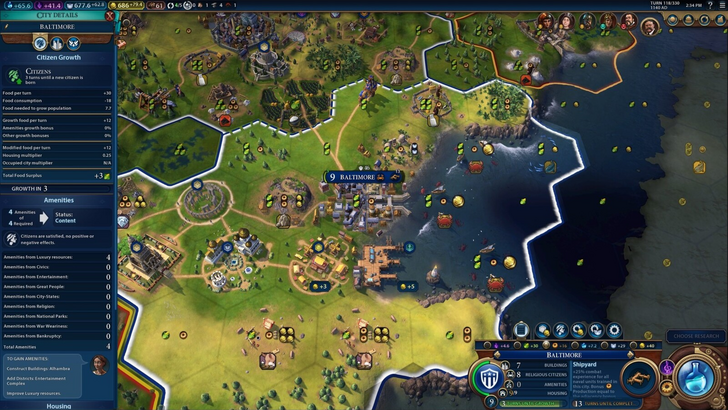
How does Civilization VII's resource summary fare? It functions, but not as effectively as it could.
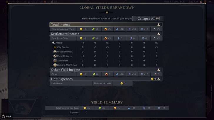
The empire-wide resource menu neatly separates data into income, yields, and expenses via dropdowns, presented in a clear table format. It offers breakdowns by district and city and can be collapsed easily. The main limitation is a lack of granularity. While you can see Rural District contributions, the UI doesn't specify which exact district or hex is producing them. Expense tracking is also limited primarily to unit upkeep.
Overall, the resource UI is serviceable but would benefit significantly from more detailed specificity.
Effective and Efficient Visual Indicators
Visual indicators use icons, colors, and overlays to convey information instantly, reducing reliance on text. A well-designed UI leverages these elements to help players process complex data quickly.
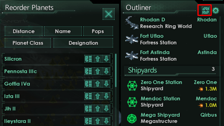
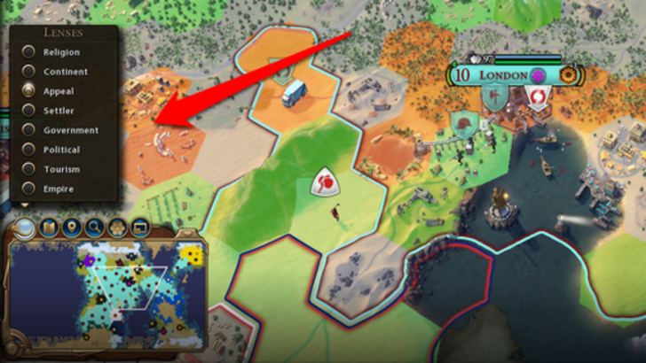
Stellaris, despite a sometimes cluttered interface, uses visual indicators effectively in its Outliner. Icons instantly show a survey ship's status (in transit, scanning, etc.) or a colony's needs. Civilization VII also employs visual cues, such as the tile yield overlay, color-coded settlement viability maps, and distinctions between rural and urban tiles on the expansion screen.
The primary complaint is the absence of certain lenses from Civilization VI (like those for appeal or tourism) and customizable map pins. However, many missing lenses correspond to features unique to its predecessor. There is definite room for improvement, but the visual indicators in place are generally functional.
Searching, Filtering, and Sorting Options
As games grow in complexity, robust search, filter, and sort functions become essential for managing information overload. These tools give players control, streamlining navigation.
Civilization VI set a high bar with its powerful map search, allowing players to find specific resources, units, or features instantly, with the camera snapping to the location. Its Civilopedia also linked entries directly to in-game elements.
This comprehensive search function is conspicuously absent from Civilization VII, representing one of the UI's most significant usability setbacks. Its addition in a future update, alongside a more integrated Civilopedia, would be a major improvement.
Design and Visual Consistency
A UI's aesthetic cohesion and thematic alignment are crucial to the player's experience. A visually disjointed interface can detract from even the most polished gameplay.
Civilization VI's UI is a masterclass in thematic consistency. Its dynamic, cartographic style feels like an organic extension of the game world, tying together leader designs, menus, and systems beautifully.
Civilization VII opts for a different direction: minimalist, sleek, and regal, with a refined black and gold palette and simplified iconography. It's a deliberate, sophisticated aesthetic choice that aligns with the game's tone. While it may lack the immediate vibrancy of its predecessor and some players find it less engaging, it is a cohesive and intentional design. Visual appeal, of course, remains subjective.
The Final Assessment
Far From Perfect, But Not Deserving of Severe Criticism
Evaluated against the criteria above, Civilization VII's UI is neither the best nor the most refined, but it is far from the disaster some claim. The lack of a search function is a notable omission, but it isn't game-breaking. Compared to other issues, the UI's flaws seem relatively minor. It may not compete with the most efficient or visually striking 4X UIs, but it has its strengths.
I'm not a UI design expert, but I understand what works for me. Civilization VII's UI gets a pass. The core game is strong enough to compensate for the interface's imperfections. With future updates informed by player feedback, it could win over more critics. As it stands, it's certainly not as bad as the loudest voices suggest.
← Return to the main article for Sid Meier's Civilization VII
Games Similar to Sid Meier's Civilization VII